Plate maps
14x
371
0→1
Overview

A tool for capturing and visualizing experimental data
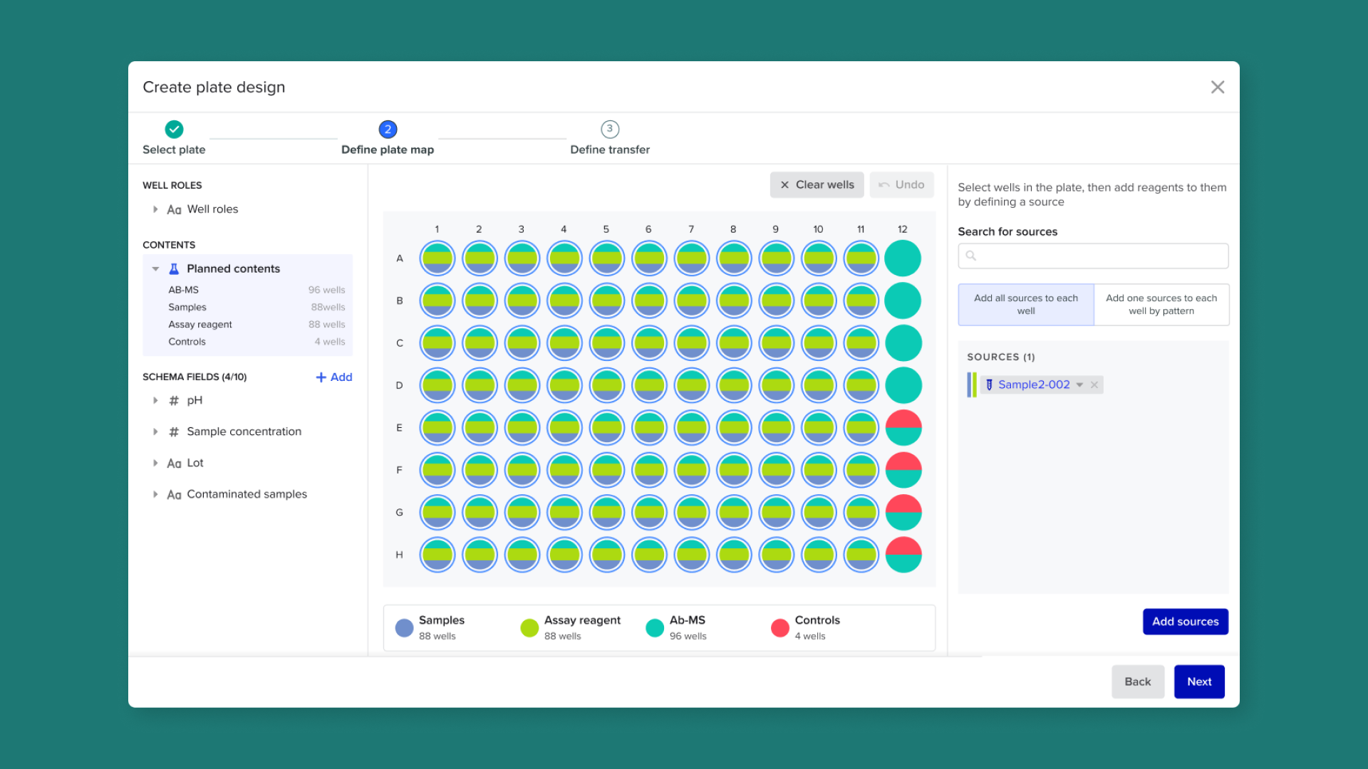
Plate maps provide scientists with easier ways to capture data and draw insights from plate-based experiments. The interactive interface allows users to visually annotate wells with experimental metadata, and fill plates with contents tracked in Benchling.
With over $3.75 million in lost ARR tied to this product gap since 2022, this release is crucial for scientists working in cell therapy, gene therapy, and antibody discovery across both mid-market and enterprise customers.
Minimize manual data entry
Planning and recording plate data in a format that matches users’ mental models eliminates the need to manually restructure unstructured data into tables
Surface insights faster
Visualizing relevant layers of metadata on a plate makes it faster to identify errors and draw insights about research programs
Preserve quality data
An immutable record of the actions taken on the plate is saved to the Notebook for data provenance and traceability
Background
Plates are used in the lab all the time, but few are recorded in Benchling
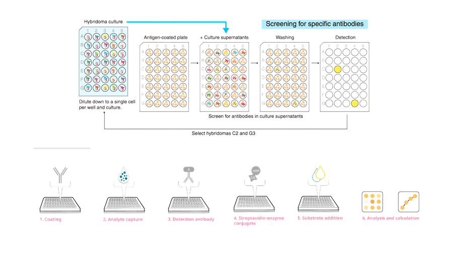
In most biology labs, it’s rare to find an experiment that doesn’t use plates. This is because each plate well acts like a tiny, self-contained experiment, giving scientists the ability to test many variables at the same time and run studies efficiently at high throughput.
Despite this prevalance, fewer than 250 plates have actually been created in Benchling (since first introduction of plates in 2016), suggesting many deep-rooted problems that have resulted in scientists turning to point solutions, Excel, or simple tables to achieve their goals.
Approach
Mapping the lifecycle of plate-based experiments
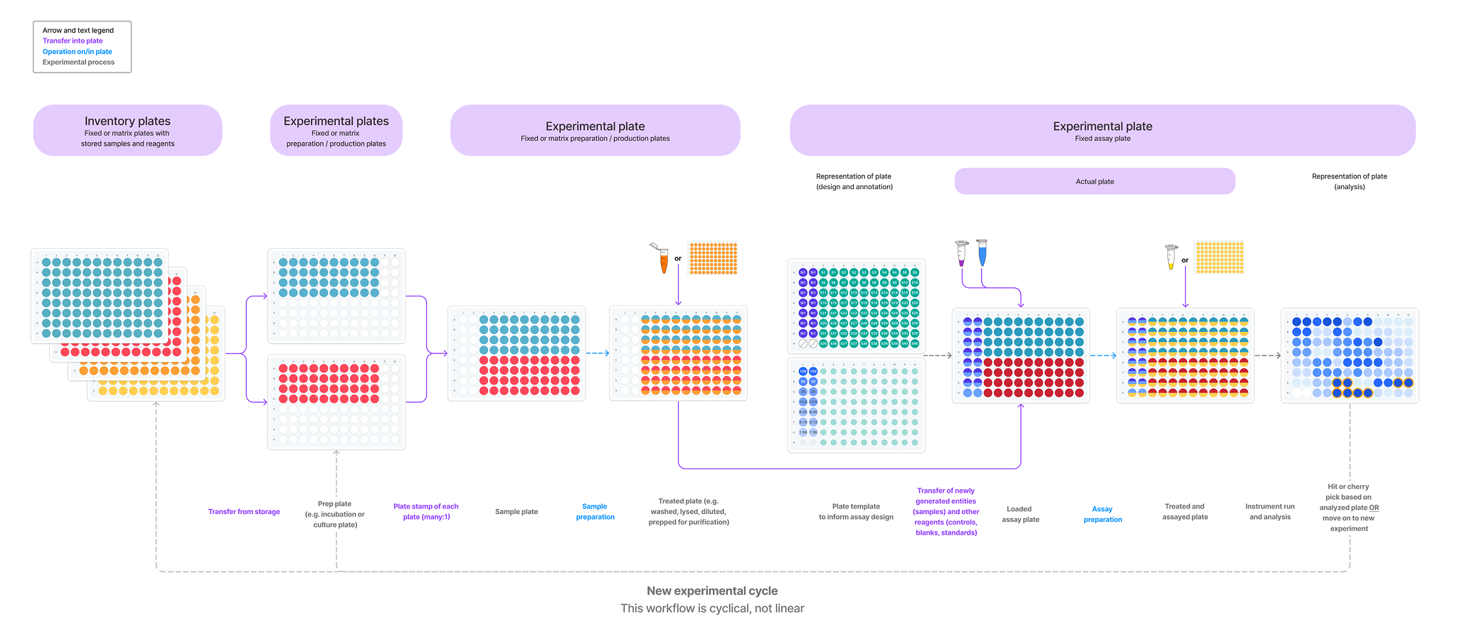
I developed a high-level model of plate-based workflows to establish a shared understanding of how plates evolve throughout an experiment. The model captured the relationship between well-level operations and plate-level planning, while emphasizing that experiments are iterative rather than linear, with each assay informing the next cycle of scientific discovery.
Deconstructing plate maps into reusable data layers
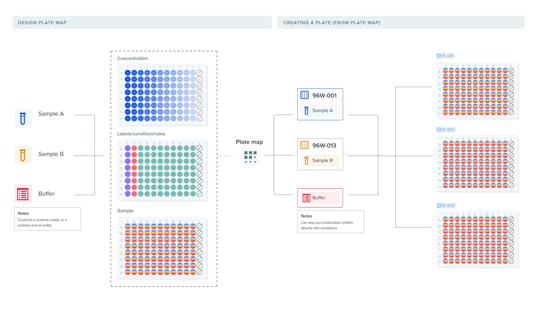
Before designing the interface, I reframed plate maps as visual compositions of independent data layers rather than single records. This approach made it easier to reason about how experimental context accumulates over time and how those layers could eventually be applied to one or many physical plates.
User research
Understanding the gaps between data model and mental model
We ran 14 moderated UX research sessions across 8 enterprise customers and 35 participants spanning bench scientists, team leads, and automation engineers. A clear pattern emerged: Benchling's data model didn't match how scientists think about a plate, forcing them to manage contents and metadata one well at a time in tables disconnected from the physical layout. This shaped three priorities: visualizing and annotating plates spatially, filling multiple wells in a single action, and capturing richer metadata directly on the plate.
14
8
35
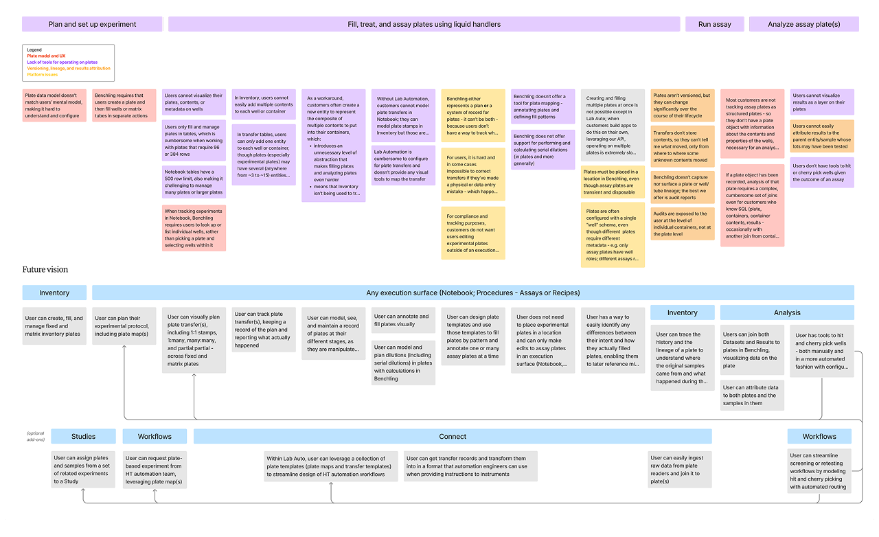
Scientists are unable to capture data in a way that matches their mental model
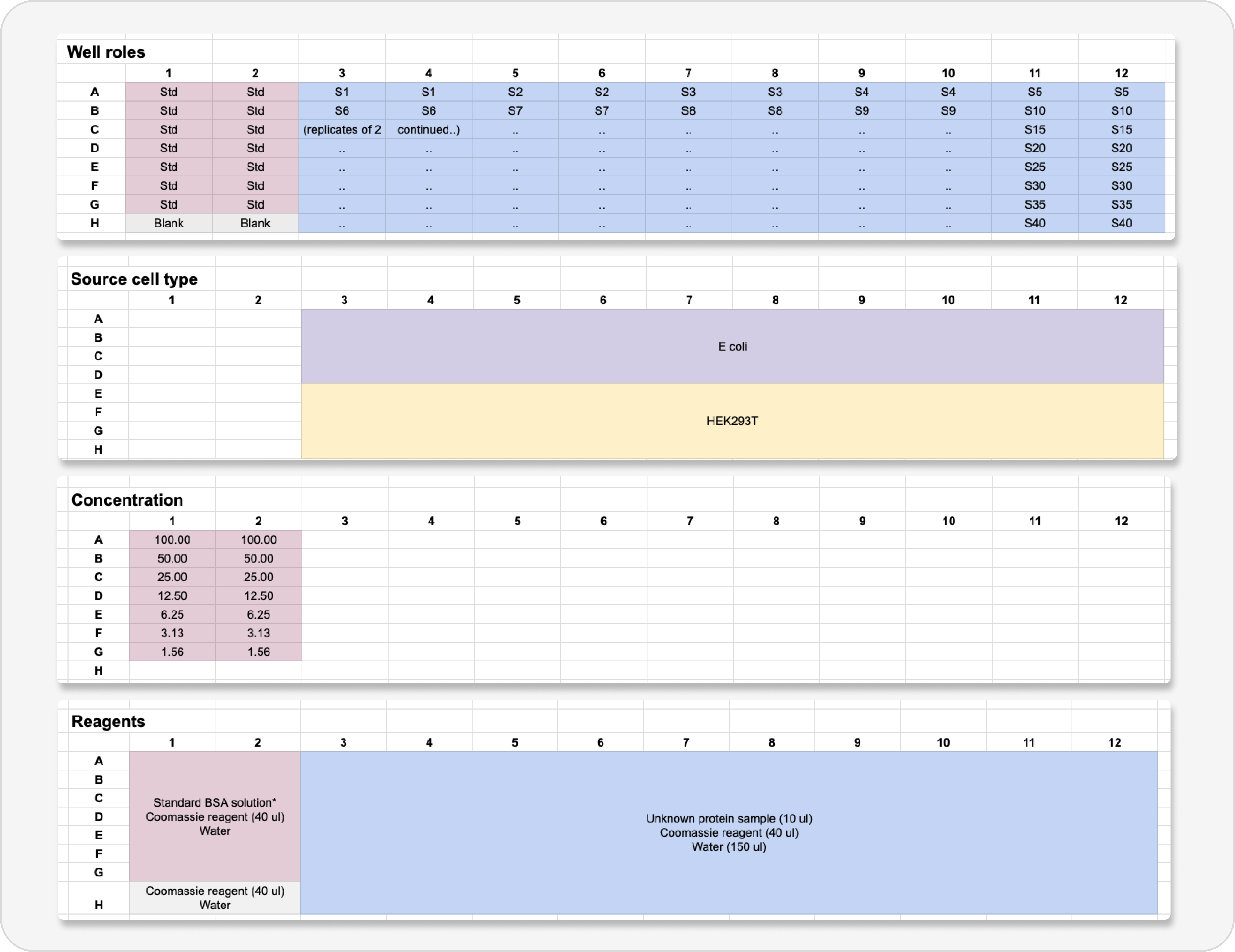
Spatially arranged data
When scientists are planning plate-based experiments, data is arranged and reocrded spatially
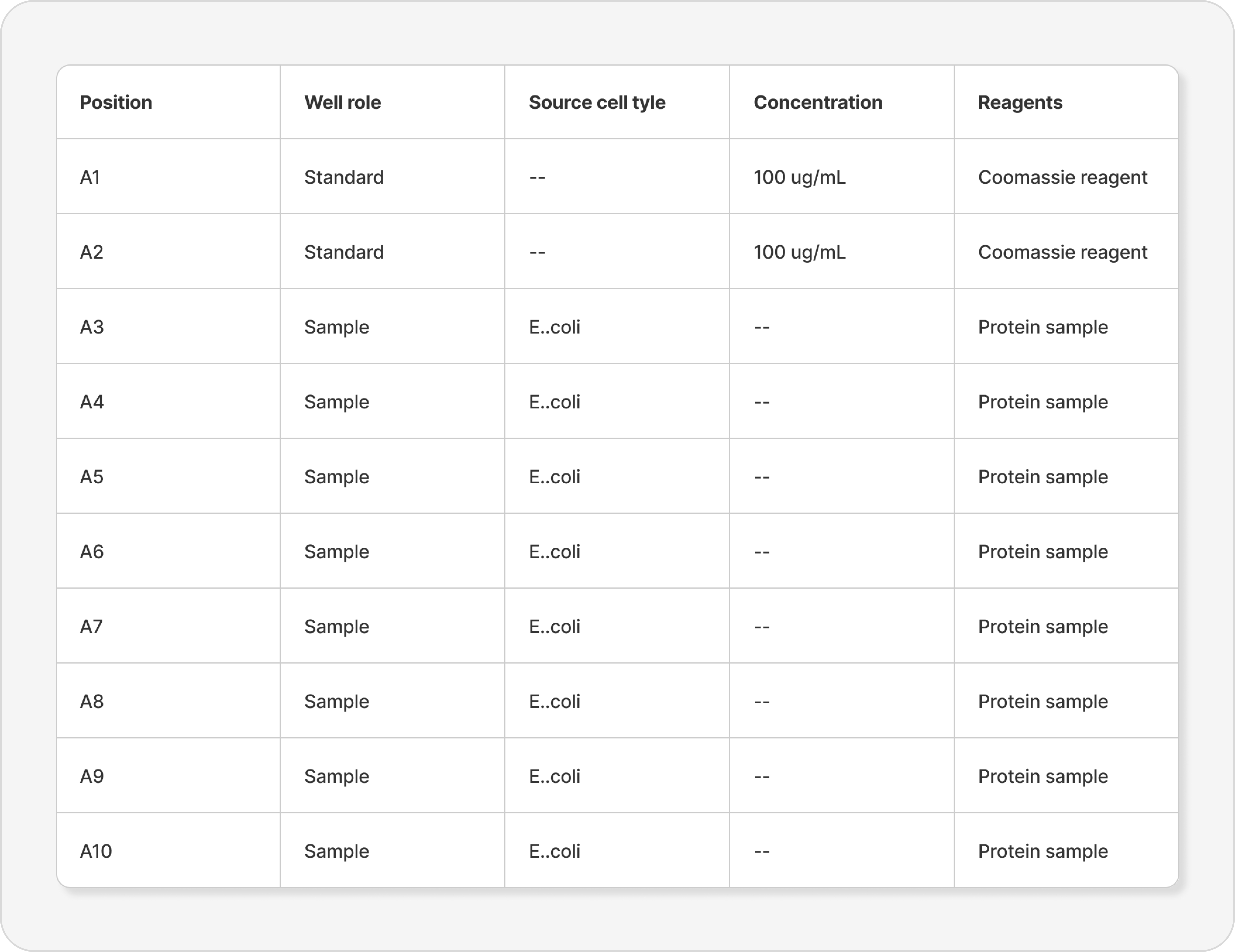
Structured data
When scientists are recording plate experiments in Benchling, the data needs to be reformatted (melted) for structured data capture
Plates lack the visual richness needed to discern well contents and enable “at-a-glance” analysis
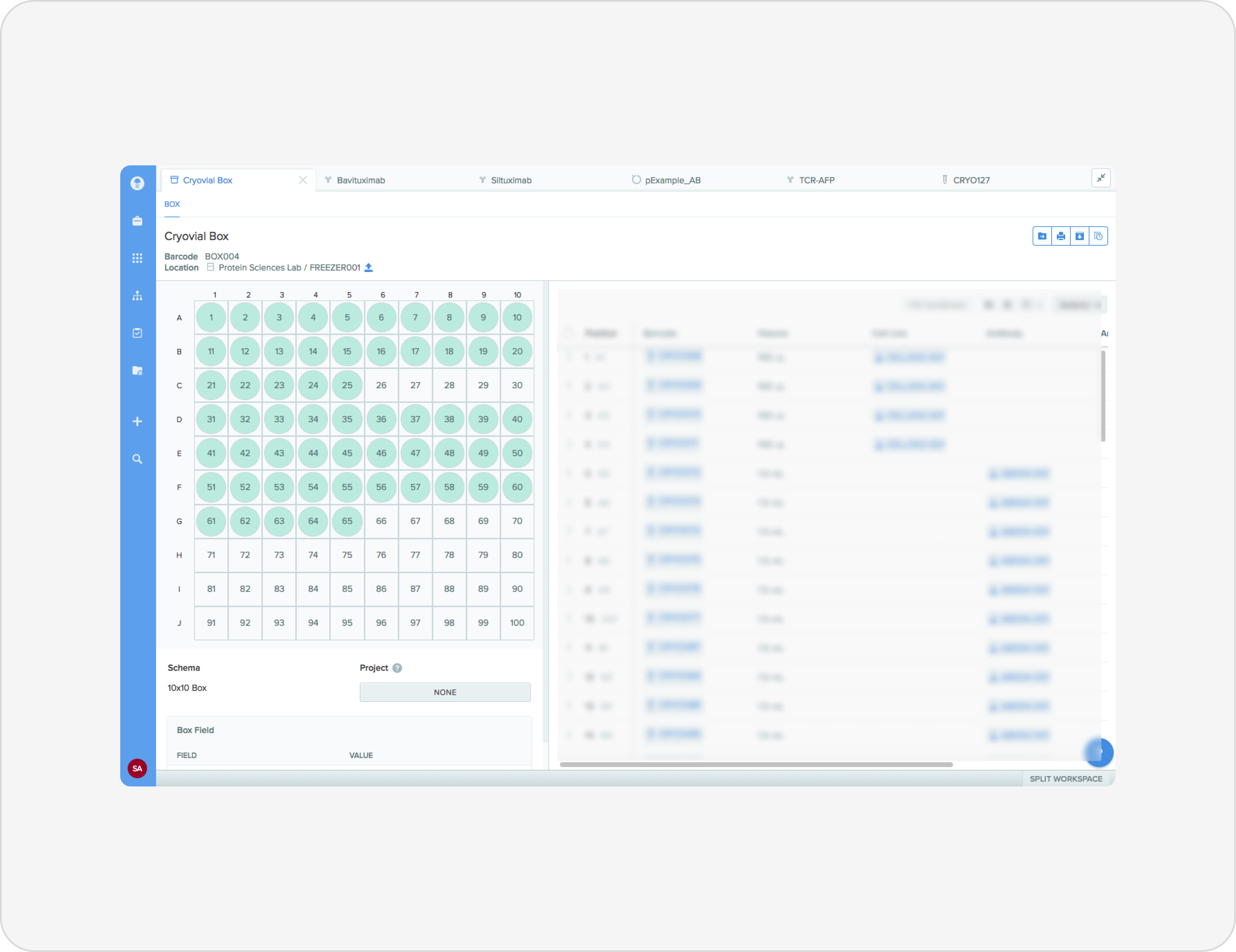
Plate wells only have two states
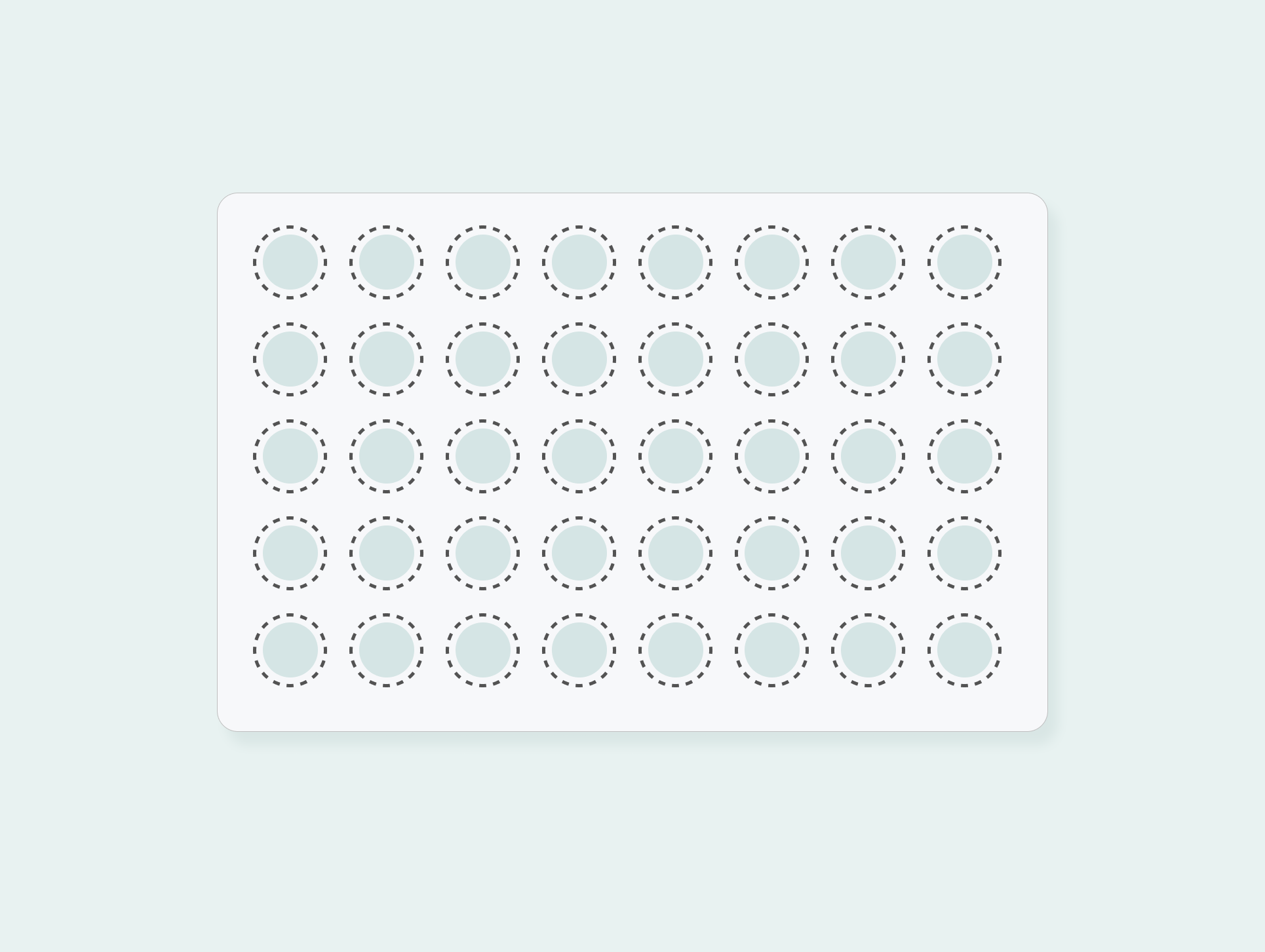
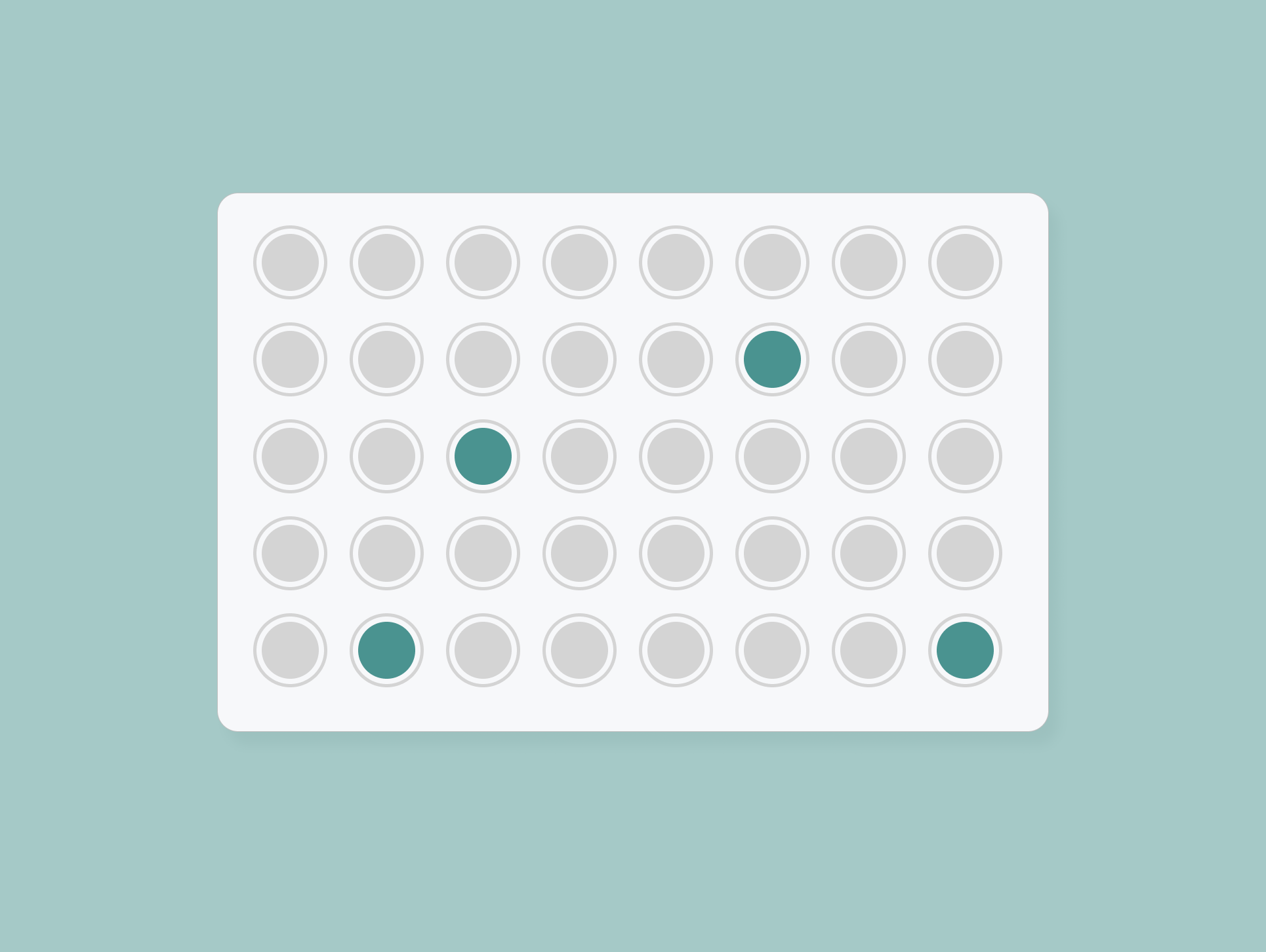
The plate tool in Benchling only accommmodated 2 visual states for wells: empty (no color) and filled (light green color)
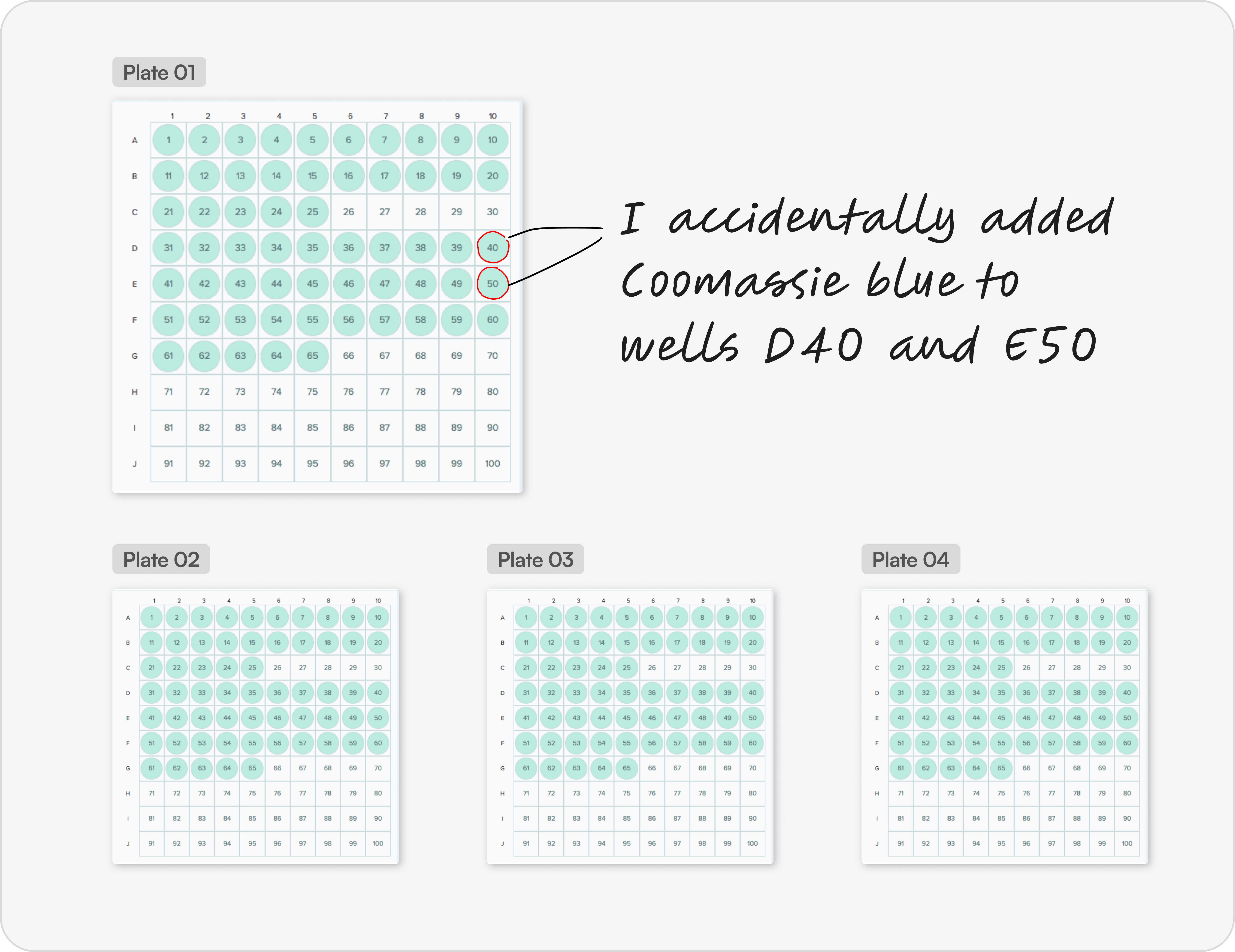
Patterns and errors are obscured across plates
Scientists can’t rely on the visualization to catch errors or spot patterns across plates, forcing them to manually identify missed or incorrect additions
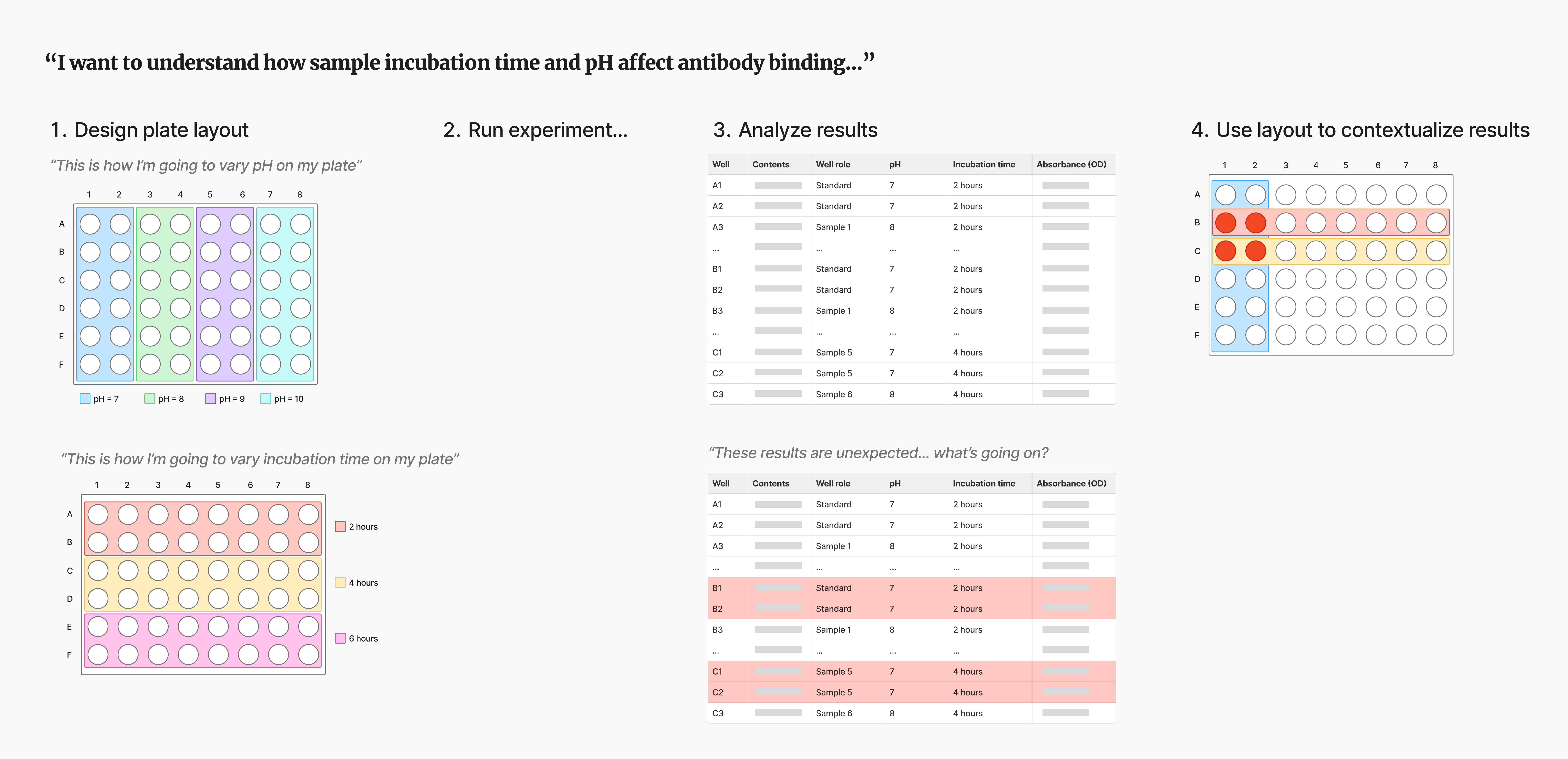
Experimental metadata cannot be visualized or easily captured
The previous plate tool allowed scientists to capture experimental metadata in structured tables. However the example below illustrates the importance of not just capturing metadata, but also visualizing it directly on the plate layout to understand how distributed variables influence experimental outcomes.
Design execution
From lab table to plate: a spatial approach to experimental data capture
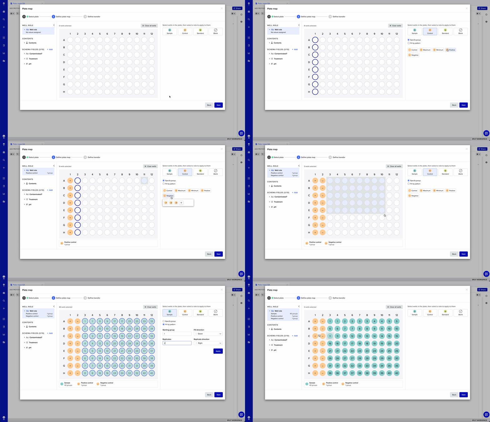
The plate map tool is designed around three moments in a scientist's workflow: annotating wells with roles and metadata, filling them with contents, and reading the resulting plate back at a glance. Rather than treating the plate as a table to be edited, the interface treats it as a canvas, allowing scientists to select, annotate, and fill wells directly on the layout itself, the way they'd already sketch a plate by hand.
What used to require mapping a physical layout into abstract rows and columns now happens directly on the layout itself.
i. Capturing metadata
Making metadata capture a first-class, visual act
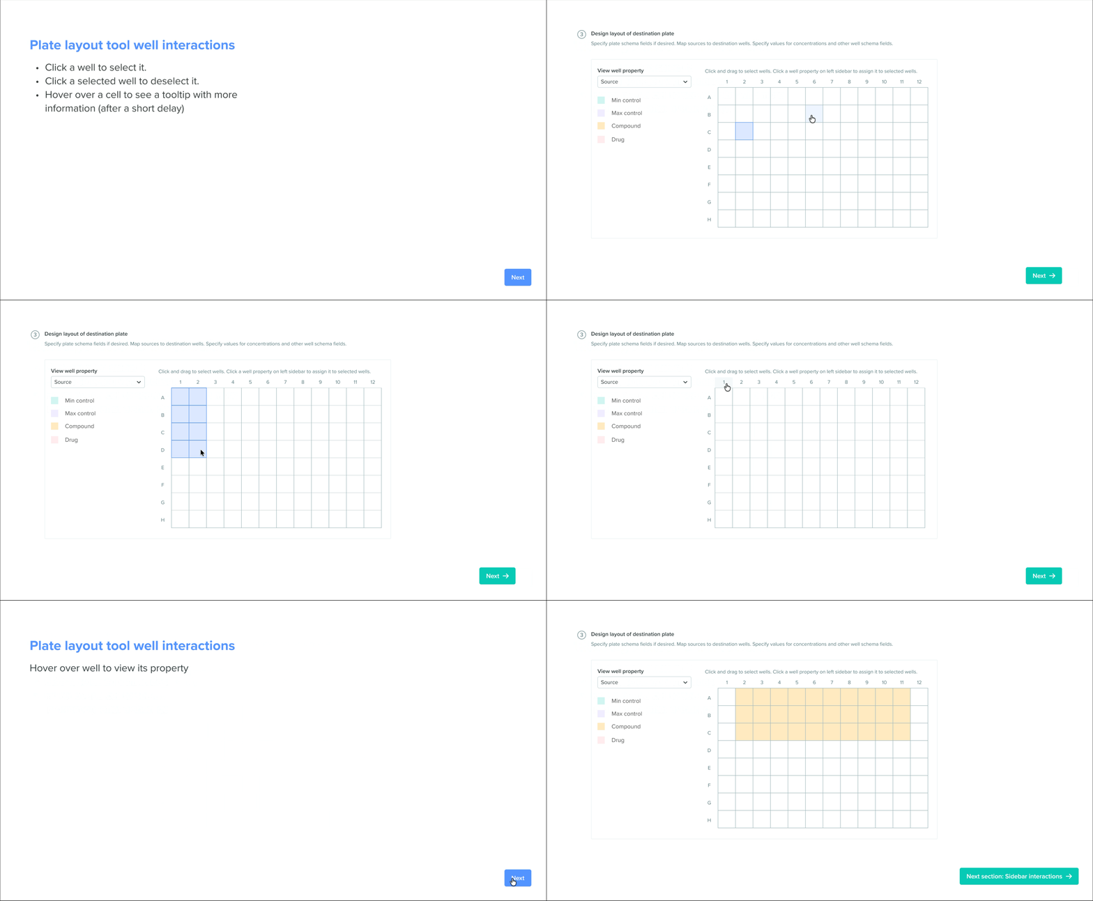
Capturing anything beyond basic contents and concentration used to mean hand-editing structured tables well by well, so valuable metadata like treatments, coatings, and contamination flags often went uncaptured or lived outside Benchling entirely. The plate map tool turns any text, dropdown, or number field on a well's schema into its own annotatable layer, so scientists can select wells and set values directly on the plate, the same way they set roles.
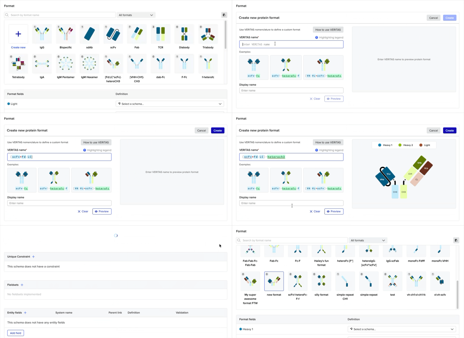
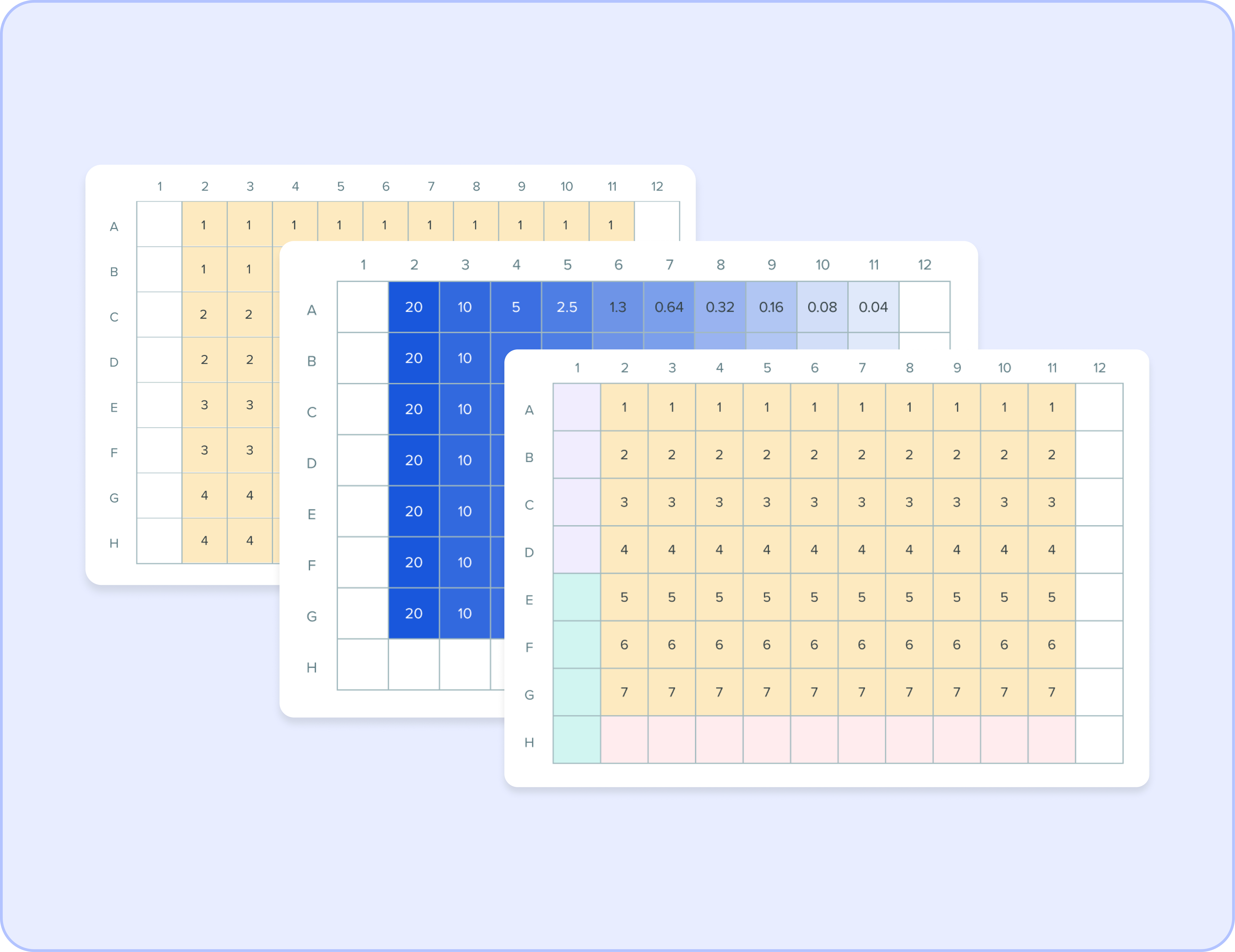
Data organized as separate layers
When planning plate-based experiments, team leads prefer to design their layouts by organizing information into distinct plate layers
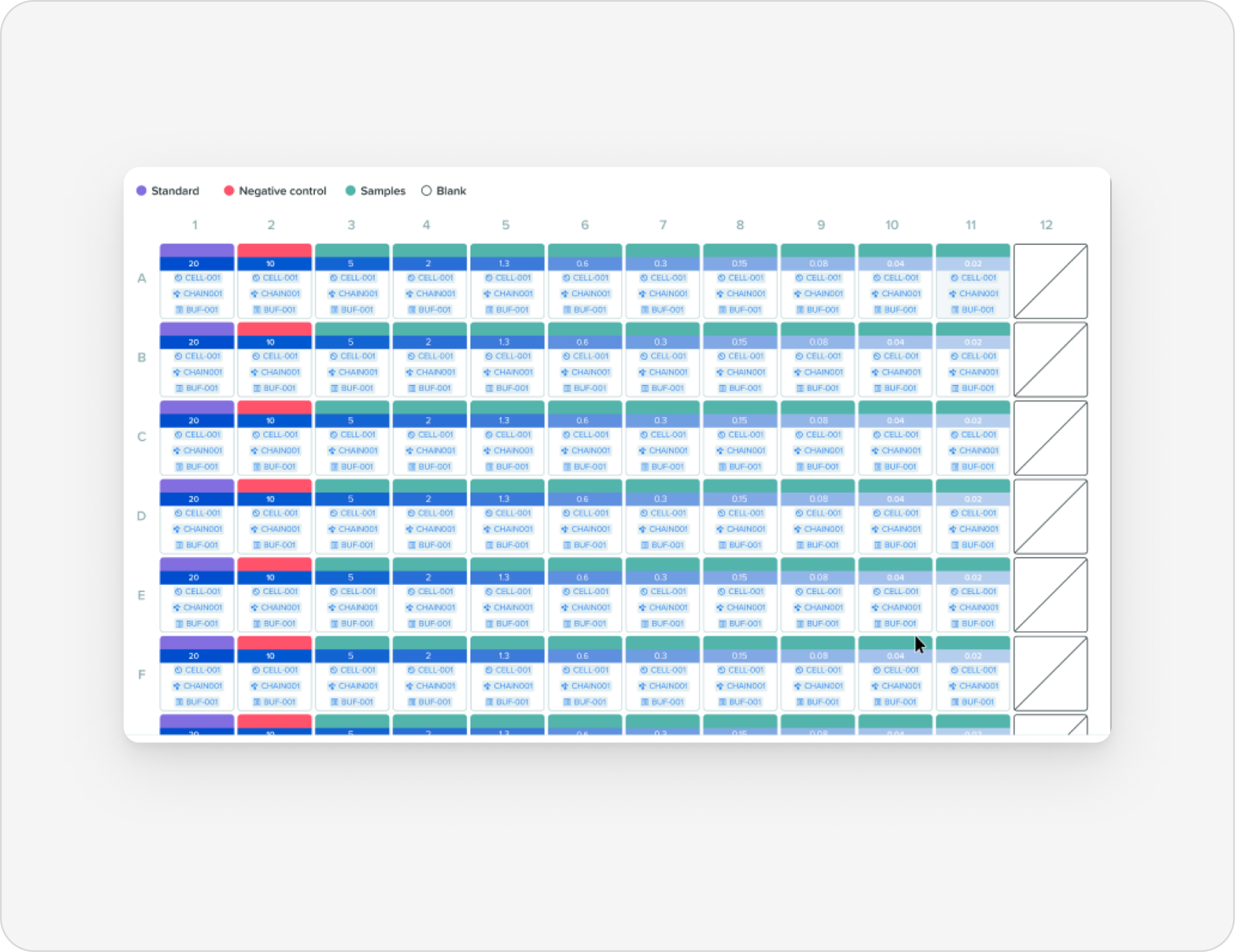
Data collapsed into one singular layer
When carrying out plate-based experiments at the bench, scientists prefer to view the plate layout with information collapsed into a singular layer
ii. Visualizing contents
Built for multi-content filling and at-a-glance visualization
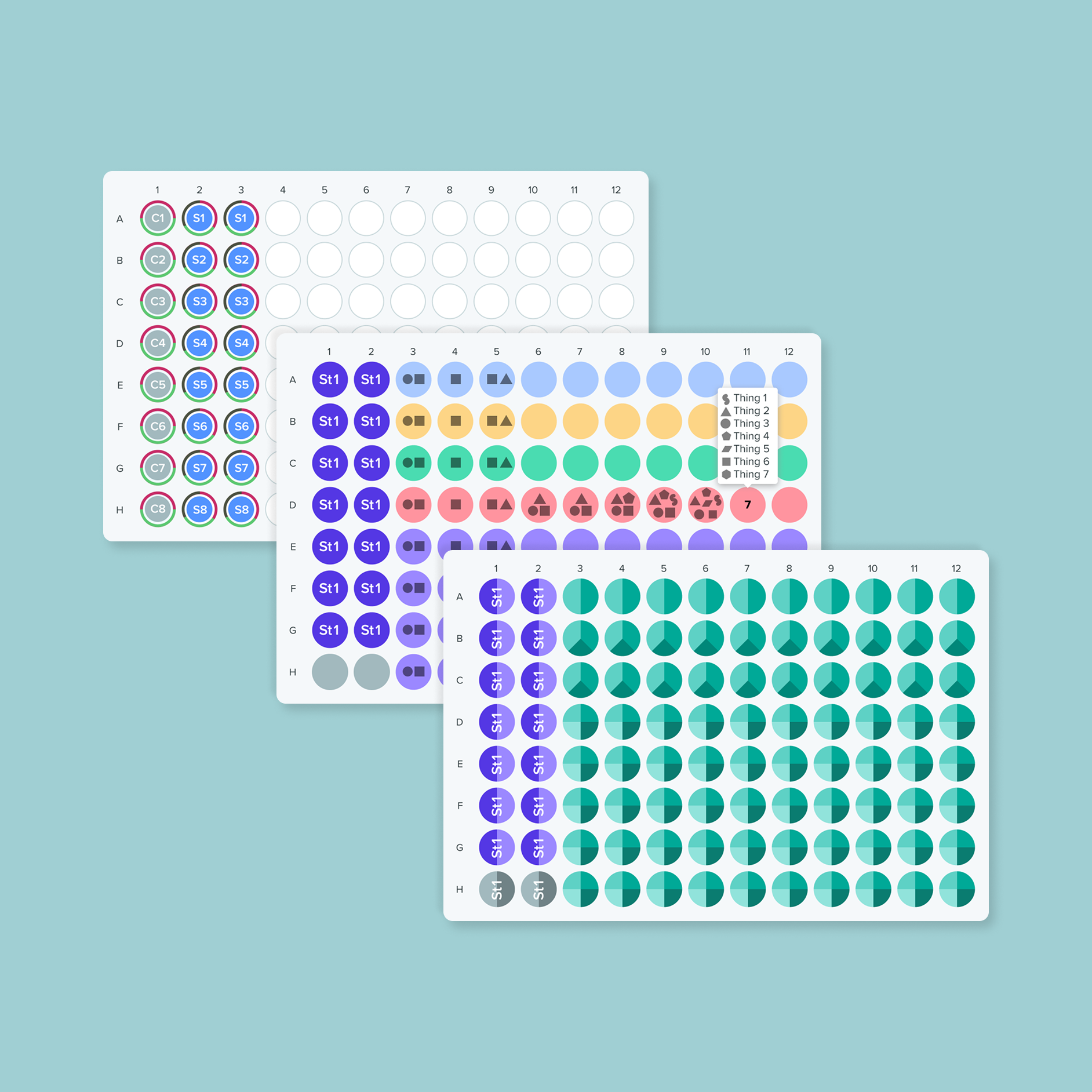
Previously, adding contents to a plate meant working one well, one content at a time, and the resulting plate offered little visual richness to tell what was actually in it. We redesigned the flow so scientists can add multiple contents to multiple wells in a single action, then see the results through a view that surfaces only the contents that vary across wells, filtering out shared contents like water that add noise without adding insight.
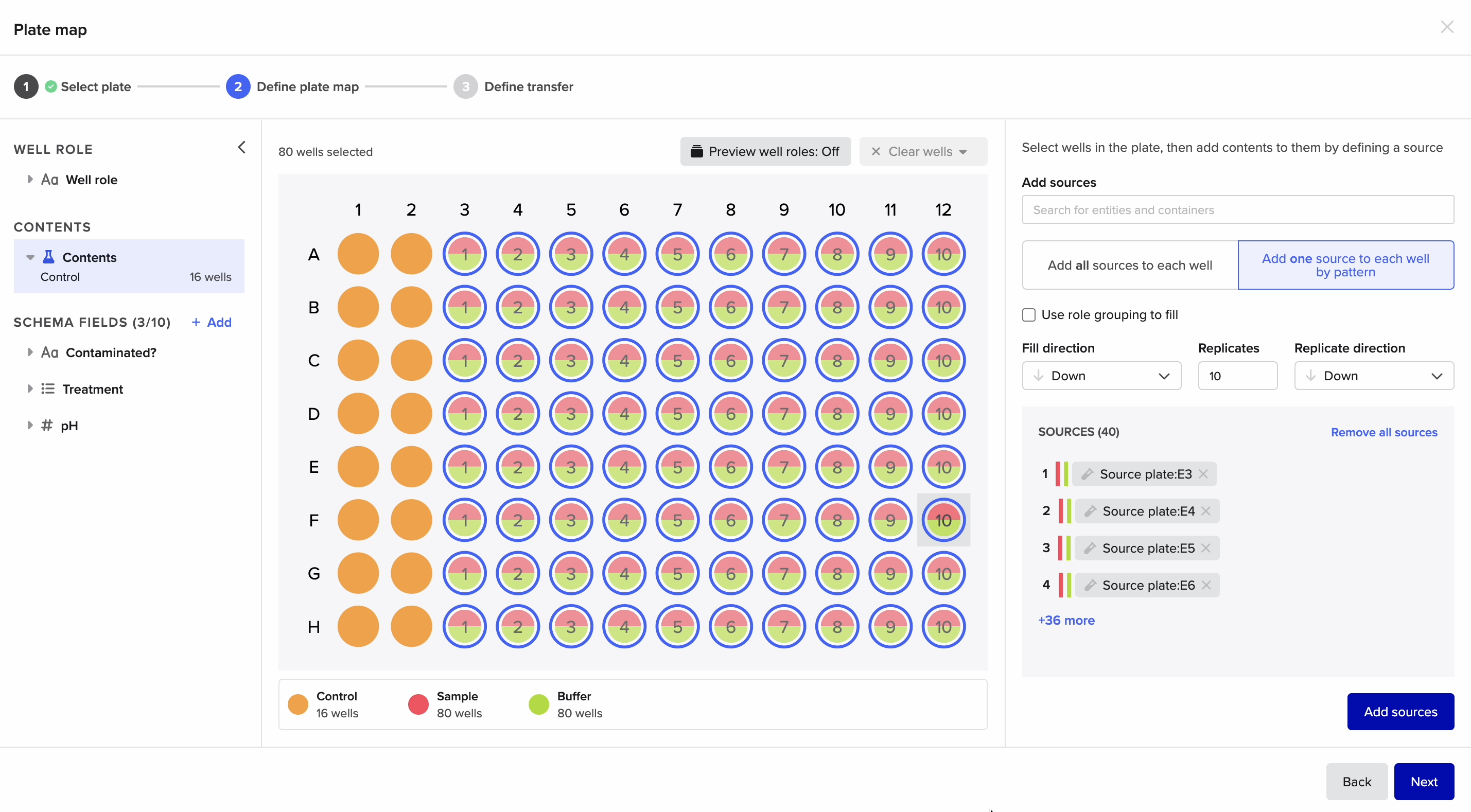
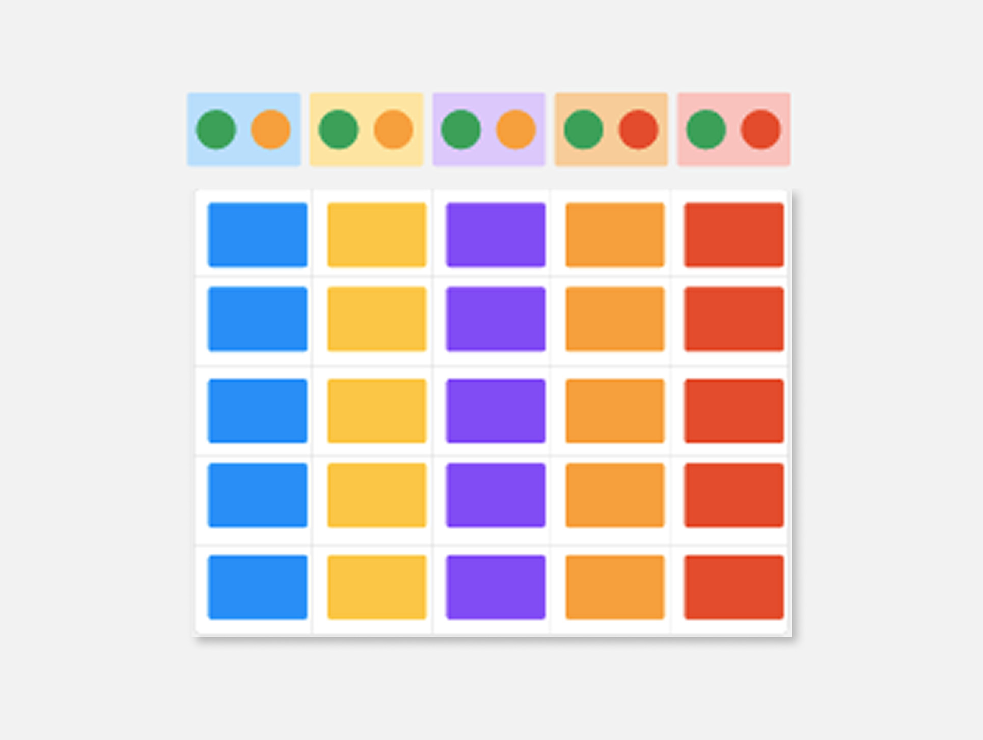
Visualize by transfer sources
If contents were added from various containers, this view surfaces the transfer sources where the specific entity contents came from
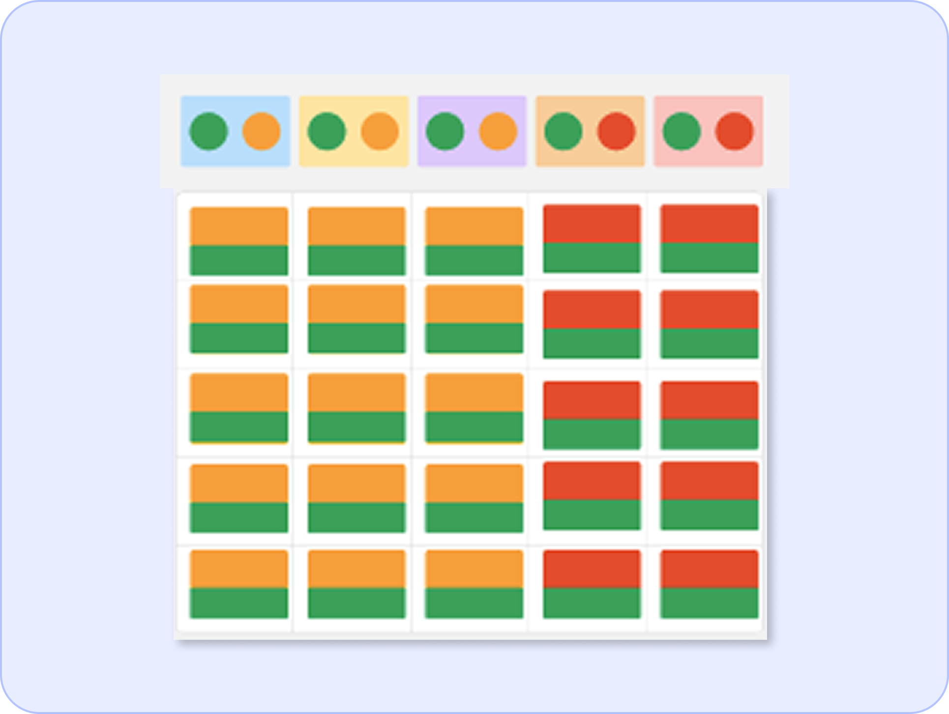
Visualize by contents
This approach surfaces every content present in each well, giving a complete picture of experimental composition
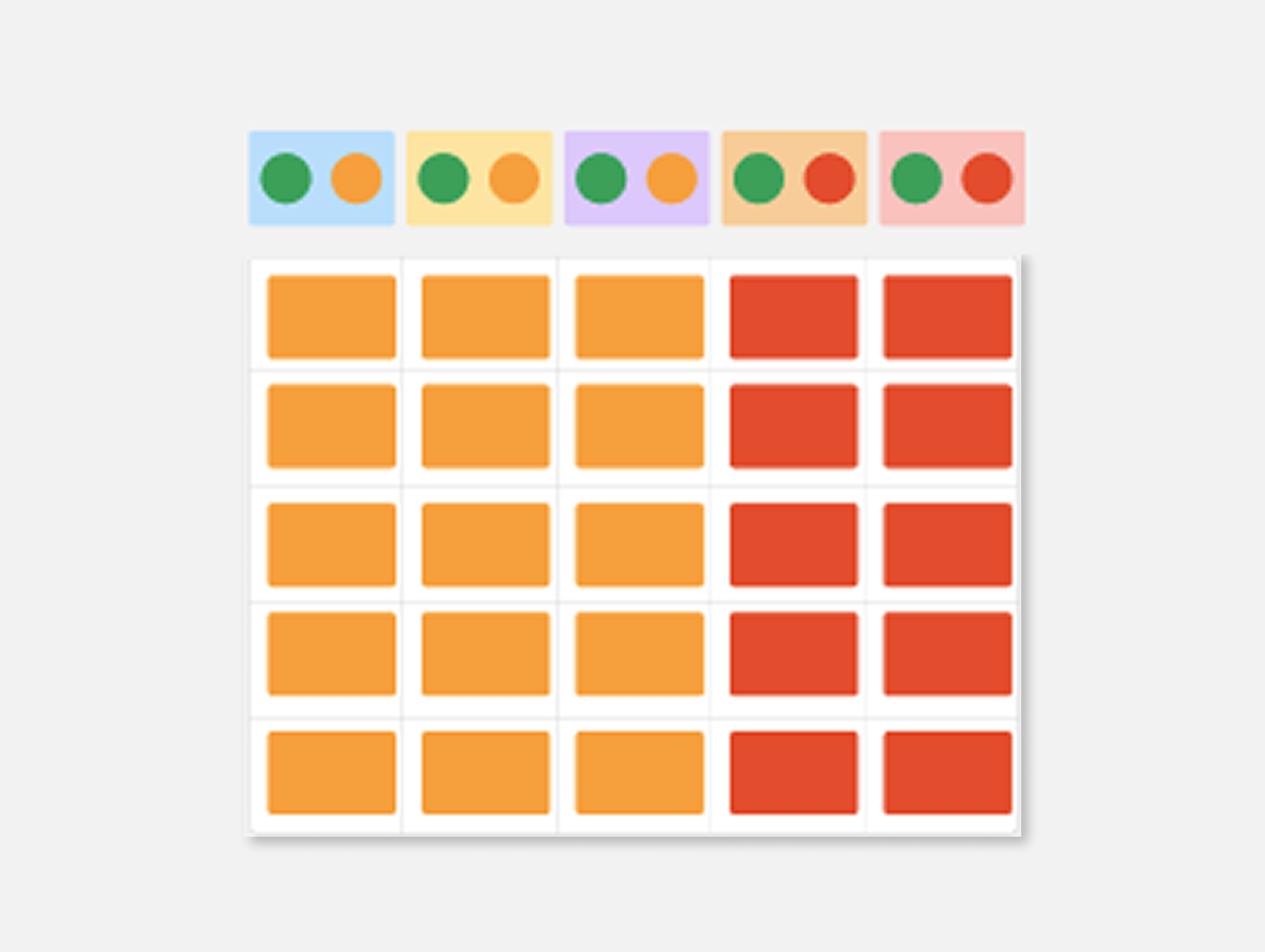
Visualize by unique contents
This view emphasizes only the contents that vary across wells, filtering out shared contents (eg. water) that may not aid understanding or analysis
Solution
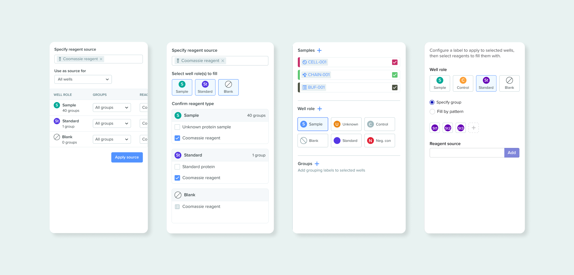
An end-to-end experience for modeling, creating and visualizing novel antibodies
Each workflow optimizes for varied thematic design principes: integrity & accuracy in modeling, flexibility & scale in creating, traceability & interaction in visualizing.
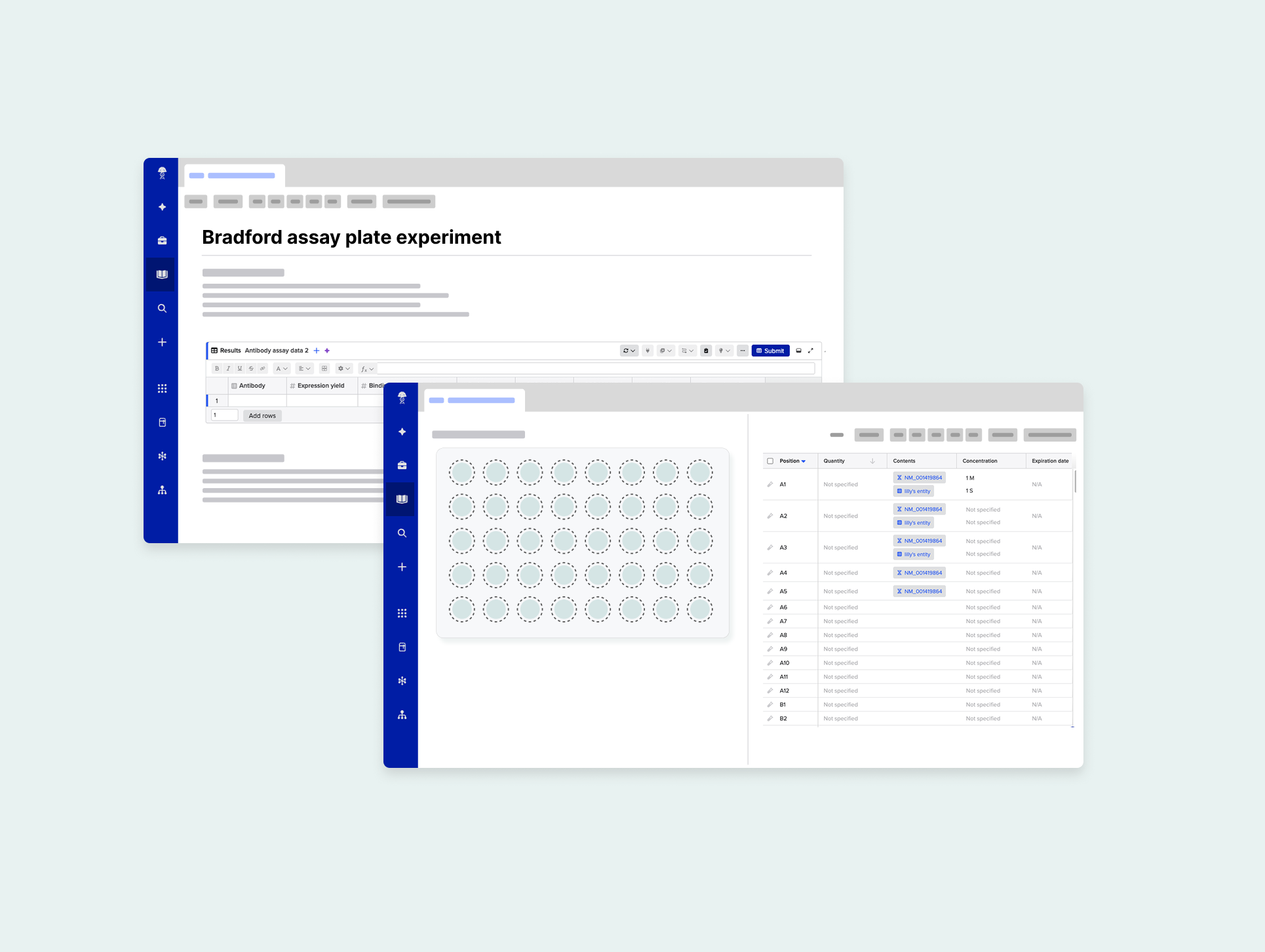
Portable across apps
The tool needed to be launched across apps, specifically Inventory: where lab items are tracked, and Notebook: where experiment context is recorded
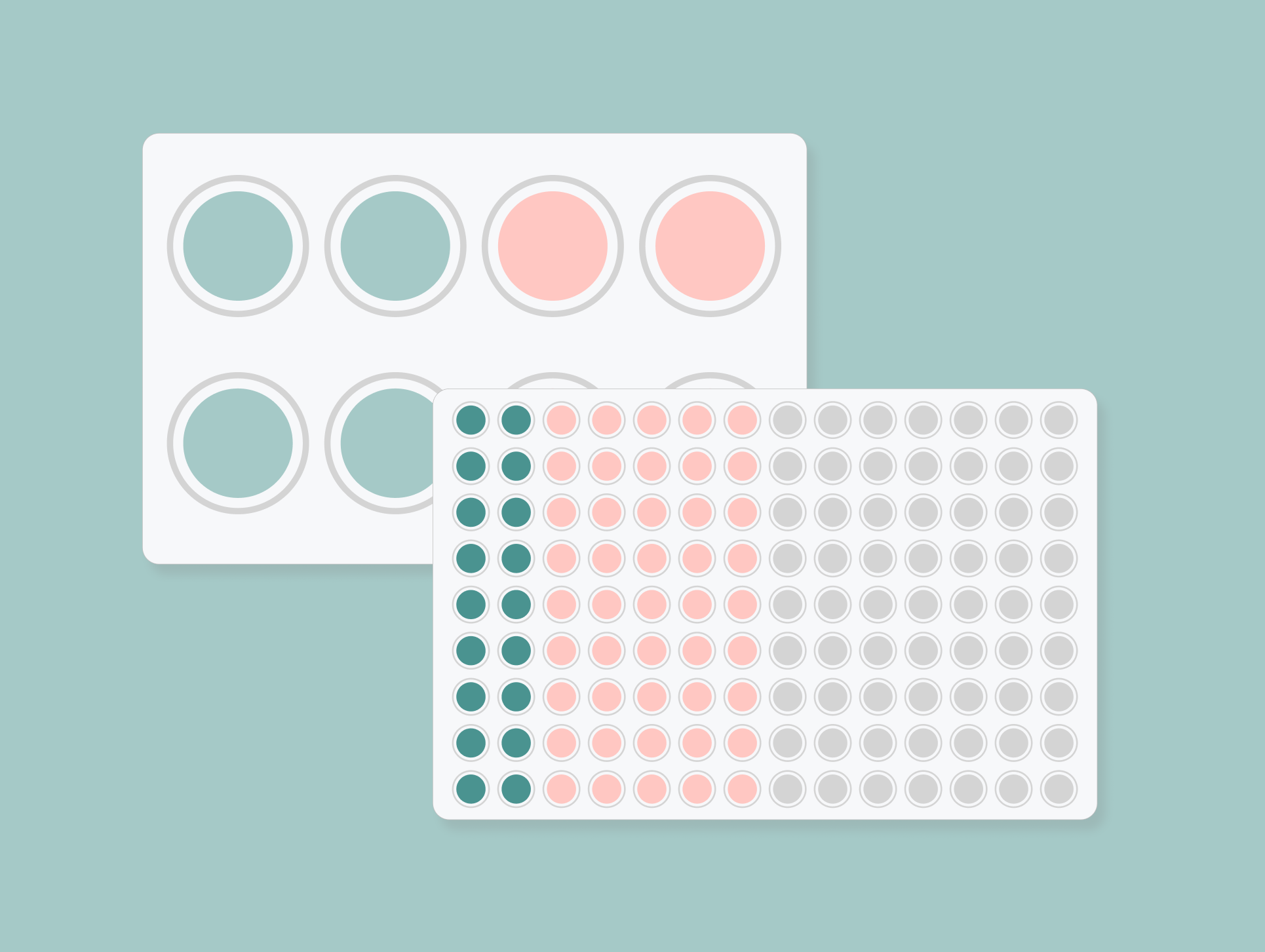
Built to scale
The UI is optimized for the most commonly used 96-well plates (12x8), but we had to consider other varying dimensions from 8 wells (4x2) up to 384 wells (24x16)
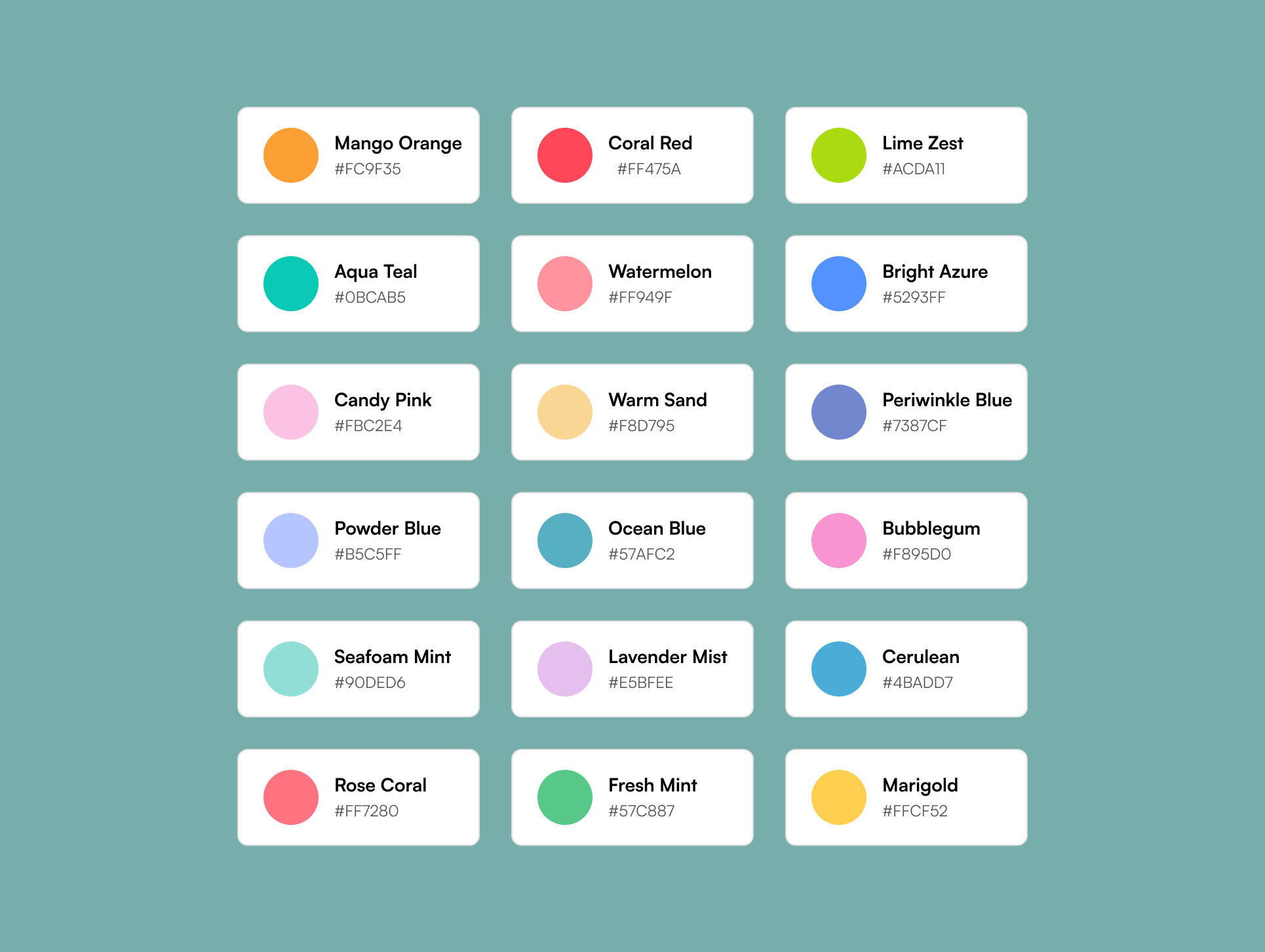
Meets accessibility standards
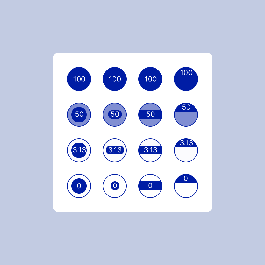
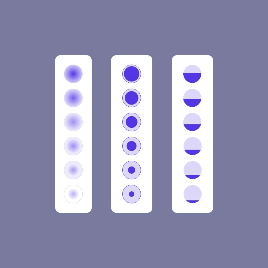
The tool’s color palette was guided by accessibility standards to ensure strong text contrast and clear differentiation for users with red–green and blue–yellow color blindness

Outcome
Rapid, broad, and deep customer adoption
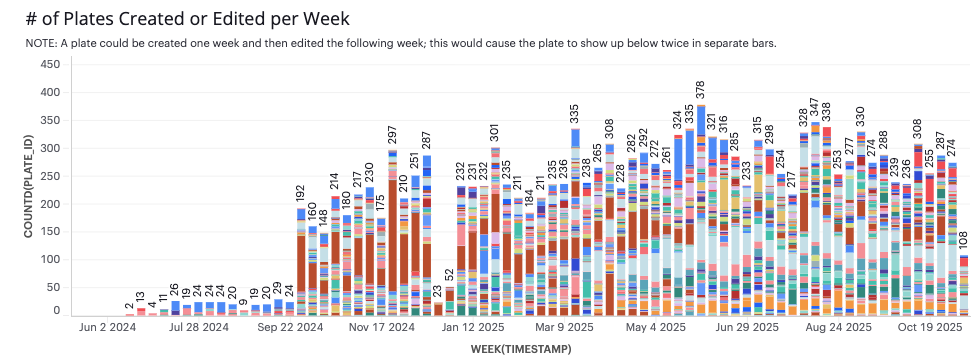
Plate maps released for general availability in September 2024. Given the strong excitement from customers at launch, we anticipated high engagement in the first month. To ensure we measured meaningful, sustained impact rather than initial momentum alone, we evaluated success based on performance over the first year.
Usage and adoption within the first month...
Plates created
Customer accouns
Active users
Usage and adoption within the first year...
Plates created
Customer accouns
Active users